Welcome to the AvMed Brand
Being a Media professional, you understand the importance of a unified, strong corporate brand. The visual identity guidelines you'll find below are the elements -- the building blocks -- that represent who we are. Our goal is to help you help you understand and apply them in a way that maintains the consistency of the AvMed brand.
Primary Colors
The logo has the most impact when it is positioned properly and when approved colors are used. Please adhere to these guidelines when using our logo:
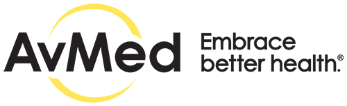
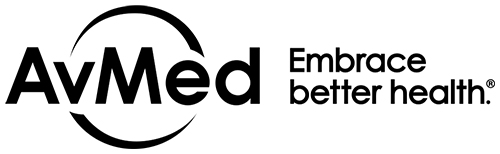
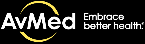
- The color logo with the tagline is our preferred option and works best on a white background.
- As a rule, always make sure the logo is large enough so that the tagline is legible.
- Do not use the tagline without the logo.
- The AvMed logo should not be smaller than 1 inch wide. For Internet and digital use, a practical minimum is 150 pixels wide. Aspect ratios must always be maintained.
- Always protect our logo from distracting elements such as text and other graphics.
- Use white space as a frame to direct the eye to our logo. Type, graphics, illustrations, headlines, etc. must not enter the protected area. This rule applies to all variations of the logo.
- The minimum required space around the logo is the height of the “A” in AvMed.
- When the logo is cutting into a background, spacing is the height of the “e” in AvMed.

CMYK = 0 | 7 | 77 | 0
Pantone = PMS 114c
RGB = 255 | 229 | 88
Hex = #ffe558

CMYK = 0 | 0 | 0 | 100
Pantone = PMS Black C
RGB = 0 | 0 | 0
Hex = #000000

CMYK = 0 | 0| 0| 70
Pantone = PMS 424c
RGB = 109 | 110 | 113
Hex = #6d6e71
Brand Logos
Our logo can stand alone or be accompanied by the tagline. However, the tagline with the logo is our preferred version. If you have additional questions concerning the proper usage of the AvMed brand please contact the AvMed Marketing department.